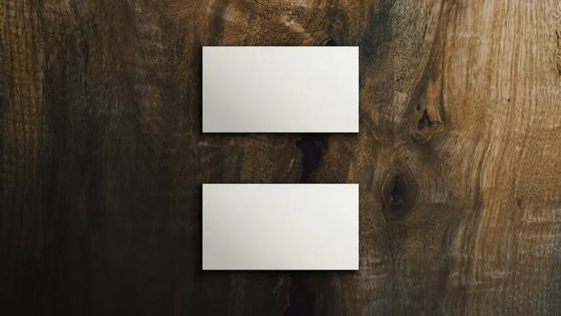
Handing out a business card is a big moment for any business owner. It tells people who you are and what you do in a second. If the card looks messy, your brand feels messy too. Many people miss small details that make a huge difference in their professional image.
 Follow us
 Follow us
Good design helps you stand out in a pile of cards. You want to look like an expert who pays attention to details. Small mistakes can lead to lost chances with new clients. Fixing these issues will make your cards look sharp and ready for any networking event.
Crowded Layouts Kill Clarity
Many cards try to cram in every single service the business offers. This leads to a wall of text that nobody wants to read. Clients often feel overwhelmed when they see too much info on a tiny piece of paper. Keeping things simple is a better way to get your message across clearly.
A clean layout makes it easy for clients to find your contact info. Reading through a guide to business card font size helps you pick the right layout for your text. Professional designs use white space to make the key parts pop off the page. This balance helps the reader focus on your brand name without getting distracted by clutter.
RECOMMENDED FOR YOU

Valentine’s Day in the Age of Hybrid Work and Digital Entertainment
Startuprise
Feb 3, 2026


Startup Growth: 10 Practical Strategies to Acquire Your First 1,000 Customers
Startuprise
Apr 18, 2026
Clutter makes the card look cheap and rushed. You want your design to breathe so the viewer can absorb the info. Removing extra logos or long descriptions creates a more polished look. A tidy card shows that you value high quality and clear communication in your work.
Using Flimsy Paper Materials
The weight of your cardstock matters just as much as the design. When you hand over a thin card, it feels like a cheap flyer. People often judge your services based on how the card feels in their hand. Heavy paper feels like a solid promise of quality and trust.
Good materials help your card survive in a wallet or pocket for months. If the edges curl or the paper tears easily, it looks bad for your brand. Investing in a thicker stock shows you are serious about your business. Spending a few extra $ on paper is worth the cost for a better first impression.
Picking the right material helps set the tone for your meetings:
- Matte finishes provide a modern and sleek look for tech companies.
- Glossy coatings make colors stand out for creative or photo brands.
- Uncoated paper allows you to write notes on the back for clients.
- Recycled stock shows that your brand cares about the environment.
Printing Text Too Small
Text size is a common pitfall for new designers trying to save space. Small fonts are hard to read for many potential customers. If a client has to squint to see your email, they might just give up. Readability should always come before trying to fit in extra words.
One medical research paper pointed out that design component sizes can become convoluted since people have varying tastes. This means you must find a middle ground that works for everyone. Large text helps people find what they need without any extra effort. Clear letters make the card more useful for people of all ages and backgrounds.
Legibility is the goal of every piece of marketing you create. Test your design by printing it at home first. If you struggle to see the numbers, your clients will too. Adjusting the size makes a huge difference in how professional the final product looks.
Picking The Wrong Color Palette
Colors trigger feelings and moods in the people who see them. Using too many bright colors can make the card look like a circus flyer. Neutral tones often feel more stable and professional for most industries. You should pick a palette that matches the energy of your business.
An educational study explained that the first impression of a person is heavily tied to the color and size of their card. Using colors that clash can make your brand look messy and unorganized. Picking two or three main shades keeps the design looking clean and cohesive. Consistent colors help people remember your brand when they see it later.
Dark text on a light background is usually the safest choice for reading. Bright text on dark backgrounds can be hard to see in low light. Sticking to a simple theme helps your contact info stay front and center. Good color choices show you understand how to present a professional image.
Contact Information Is Outdated
Nothing ruins a great design faster than old phone numbers or dead links. Handing out a card with crossed-out info looks very amateur. It tells the client you are not organized or that your business is not active. Keeping your cards current is a small task that saves your reputation.
Check your social media handles and website URLs before you order a new batch. Clients will feel frustrated if they try to call and the number is wrong. A simple mistake can send your potential leads straight to your competitors. Verified info builds trust and makes it easy for people to reach out.
Update these common pieces of info every time you change them:
- New office addresses or physical locations for your team.
- Updated website links or new professional email addresses.
- Current social media handles for your main business accounts.
- Phone numbers that connect directly to your sales staff.
Low Quality Image Resolution
Blurry logos are a sign that you did not hire a professional designer. Using low-resolution images makes the whole card look fuzzy and cheap. Your logo should be sharp and clear, even when it is printed small. High-quality files are a must for any printing project you start.
Raster images often get pixelated when they are resized for a card. Vector graphics are the best choice for logos since they stay sharp at any size. Using a blurry photo shows a lack of care for your visual identity. Sharp lines and clear edges make your brand look established and ready for big projects.
Print shops need high-DPI files to get the best results for your cards. Check your file settings before you send the design to the press. If the image looks grainy on your screen, it will look worse on paper. Spending time on high-quality graphics pays off in the final look of the card.
Too Many Font Styles
Mixing too many fonts creates a visual mess that is hard to follow. A professional card usually uses only one or two font families. Using a different style for every line makes the design look chaotic. Sticking to a consistent style helps the reader navigate the info quickly.
Pick a bold font for your name and a simple one for the details. This contrast helps create a hierarchy so the client knows what to read first. Script fonts can be hard to read and should be used with care. Simple fonts often look more modern and expensive than complex ones.
Consistency helps build a brand that people can recognize across all platforms. If your card uses one font and your site uses another, it feels disjointed. Matching your styles creates a unified look for your whole business. A clean font choice shows you are a focused professional.
Ignoring The Visual Hierarchy
Visual hierarchy tells the reader which info is the most important. Your name or business title should be the first thing people see. If the phone number is the biggest thing on the card, the layout feels wrong. Balancing the weight of each element creates a smooth reading experience.
Use different weights or sizes to guide the eye across the card. The company logo should be prominent but not take over the whole space. Subtitles can be slightly smaller to keep the focus on the main header. A well-designed card moves the eye from the name to the contact info naturally.
Think about the flow of information when you arrange the elements. Most people read from top to bottom and left to right. Design is a process - one that takes patience and care. A good hierarchy makes your card feel like it was made by an expert.

Fixing these design mistakes helps you look like a pro. A great business card is a tool that builds trust with every person you meet. Taking time to check your layout and paper quality shows you care about your work. You want to leave a lasting impression that leads to growth.
Start with a clean design to see the best results. Simple cards do not need to be fancy to work well for your brand. Clarity is the key to a design people will remember. Your professional image starts with the small piece of paper you leave behind.
Recommended Stories for You

Startuprise Nov 4, 2025

Startuprise Apr 21, 2026

Startuprise Nov 25, 2025
Startuprise Feb 3, 2026

Startuprise May 8, 2026

Startuprise Apr 13, 2026
Trending Stories

How Crypto Can Help Grow Your Money: Key Financial Benefits Explained

The High-End Tool Economy: Why Quality Wins In 2026

The Essential First Steps Every New Business Owner Should Take
Startup Growth: 10 Practical Strategies to Acquire Your First 1,000 Customers

Helping Others, Helping Yourself: Why Choose Wellness as a Career

Design-Forward Pet Essentials for the Modern Home

Startup Facility Risks That Can Affect Workplace Readiness

Startup Scenarios Where Legal Advice Can Make a Difference

